Data on Writing about Data: Results from trying 7 online readability tools
Detailed data on my evaluations of 7 tools that calculate 6 readability metrics used to improve writing. Supplement to "Write on! 7 free tools for more readable writing on a shoestring".
I’m on a 2024 quest to become a more readable writer. I’ve looked into readability metrics, chose 6, surveyed 14 readability analysis tools, and chose 7 to evaluate. This post shares my evaluation results. Next up: my decision on which tool(s) to use in my ‘ethical shoestring’ toolkit.
My main post on readability metrics, tools, and evaluations is here. Five bonus pages provide details:
Readability features of Microsoft Word and why I’m looking for a new tool.
What “Readable” means, 16 metrics, the 6 I chose to evaluate, and why.
14 readability analysis tools besides Word, the 7 I chose to evaluate, and why.
Scoring for Word and the 7 selected tools on the 6 selected metrics. [YOU ARE HERE]
Post Contents:
Acronyms
GL = Grade Level
Readability Analysis tool names
CC = Character Calculator
DY = Datayze
GRAM = Grammarly
RF = Readability Formulas
TCR = TextCompare Readabilit (not a typo; it’s how they spell the product name)
WC = WordCalc
WFX = WebFX Read-Able
WORD = Microsoft Word
Readability metric names
ARI = Automated Readability Index GL
FRE = Flesch Reading Ease score
FKGL = Flesch-Kincaid GL
FOG = Gunning Fog Index GL
FOR = FORCAST GL
LW= Linsear Write GL
SMOG = Simple Measure of Gobbledygook Index GL
Data Cleaning and Preparation
To calculate the readability statistics and counts in Word and the other 7 tools, I used plain text files with emojis, no hashtags, and no endnotes or LinkedIn URLs. This section explains why. (If you’re more interested in the results, this link will take you to the next section.)
Word’s handling of rich text. Since I already measured 66+ of my posts with MS Word, I want to use its counting and scoring as a ‘baseline’ for comparing to the other 7 tools. I had discovered earlier that MS Word did not correctly count with rich text and hyperlinks. For the evaluation baseline, I trimmed off titles and created plain-text DOCX versions of the 5 posts.
Other tools’ handling of rich text. I did some tests on each of the tools, pasting rich text into their browser windows. Looking at the processed text showed that line breaks were all messed up. Then I created TXT files with true plain text. When I pasted from the TXT file into the tools, the line break issues were reduced.
Maximum post length. I truncated the Case 5 file to 3464 words - the last whole sentence under RF’s 3500-word limit. (I already verified that all other candidate tools can handle the full 4600+ word post.)
URLs significantly skew the metrics. To keep URLs from confounding this evaluation, I lopped off the footnotes section in the Substack articles and manually removed the URLs from the LinkedIn post texts.
I did not remove the footnote references. That would have meant some tedious editing; some of my articles have 45 footnotes. These numbers did cause problems for some of the tools, creating some overly long sentences.
Non-letters. Some of my posts include emojis, and my LinkedIn posts typically include hashtags. I decided to leave in the emoji characters that survived the plain text conversion, for now. It’s rare for me to use more than 10, so emojis should be “in the noise”. I’ll look into their impact later if needed. I removed hashtags from the LinkedIn posts, though.
For the 7 tools I evaluated, in my first tests I pasted the rich text into the editors. Then I repeated the tests using the equivalent TXT versions of the posts. This confirmed that some tools handle TXT file input differently than a “plain text” DOCX file.
(Why did I do it both ways? To see if the input format affected the counts and metrics. I would love to be able to skip the extra step of creating a DOCX or TXT file to upload for scoring.)
Note: No current tools appear to consider the readability impact (good or bad) of images, tables, graphs, formatting, or headings in a post. In plain text, the section headings I use look like unpunctuated sentences.
Evaluation Details and Analysis of Results
A rigorous study would require much more data than 5 example posts. However, none of these tools appear to offer APIs that could reduce the manual labor of analyzing the posts. And I don’t need academic rigor. I’m looking for useful insights that I can get with minimal work and cost. So my tool choice doesn’t have to be perfect.
Choosing a readability tool is a “two-way door”. If I change my mind later, I’ll have rework to re-score my writings to date, but nothing is lost except my time.
I could have just flipped a coin, or picked one to try. I’m doing this data analysis because I can, and I enjoy it. And it’s a good way to build my new Datawrapper muscles, as well as my knowledge about what makes writing readable. 😊
Common Patterns Across 5 Cases
I naively hoped that the tools would produce extremely similar results, so that I could choose my new tool based on factors like ease of use. Reality laughed at me.
Most tools did not handle rich text well. Variations in base counts were significantly reduced, but not eliminated, by using TXT inputs.
Across all 5 cases, here are seven patterns that persisted even after switching to TXT inputs.
1. Tools count Sentences and Lines differently.
RF warns when more than 20% of sentences (e.g. titles and some bullets) do not have ending punctuation. In these cases, it uses the line count instead of the sentence count for the metrics.
Based on the values of the counts and metrics, GRAM appears to also adjust its sentence counts, but silently. Other tools may be doing this as well.
2. DY sentence counts run high.
Many metrics use the number of sentences in the denominator. Inflated counts will drive the metrics lower. DY’s displayed sentence counts run high, and using lines instead of sentences doesn’t always explain why.
However, the data indicates that DY might use a different, unshared sentence count in their passive voice detector. Examples:
Case 4 - 123 total sentences and 19 passive voice sentences, but “12.1%” passive voice. 12.1% of 123 is about 15, not 19.
Case 5 - 238 total sentences and 25 passive voice sentences, but “9.8%” passive voice. 9.8% of 238 is about 23, not 25.
3. Counting syllables of English is hard.
Examples: Under DY “Hard Words”, “likely”, “rarely”, and “someone” are all flagged as 3 syllables. In standard American English, these are pronounced as 2 syllables. They may be counting vowels, and considering the ending Y and E as vowels that form a third syllable. Peoples is also flagged as a 3-syllable word. Ageism is counted as 4 syllables. Relatively is counted as 5.
Counting “complex” words is also inconsistent. Some metrics rely on syllable counting. Others use word lists. Some do both. So differences between metrics are expected. Big differences between tools for the same metric are not.
4. Grade Levels are inconsistent across tools.
This is partly due to varying sentence and syllable counting, and partly due to varying precision. Some tools, e.g. Grammarly, show whole grade levels (e.g. “9th grade”). Other tools give more precise calculated values (e.g. “8.63”).
5. The criteria for “rare” words aren’t uniform across tools.
Example: Across all cases, GRAM identifies as “rare” ~3-10x as many words as DY. These counts aren’t used in any current metrics, though.
6. Variances in reading and speaking time estimates are high.
In part, this is because CC only estimates times in whole minutes. The other two tools give times to the second.
7. Passive Voice measurements are inconsistent.
Examples: RF consistently counts about half as many Passive Voice Sentences as DY. WORD typically counts 50% more than DY.
After seeing these variations, I tried adding a free counting tool to the mix. Wordcount.com’s SyllableCounter doesn’t calculate any readability metrics, but I hoped it might shed light on the accuracy of the counts. Its results were in the middle and didn’t seem more definitive than what I had, so I stopped tracking them.
Tool Summaries Across All 5 Cases
In theory, the counts of the text elements should be identical across all tools. As noted above, they’re not!
This section shares my findings in Datawrapper tables and graphs. Per-case details, with simple data table screenshots, are in “More Data on Writing about Data: Details on the 5 Cases Evaluated for Readability”.
The tables and graphs below summarize:
the normalized standard deviations from the 5 cases evaluated.
When aggregating data across tools, I mostly used medians instead of averages because of the outliers and inconsistencies among the tools.
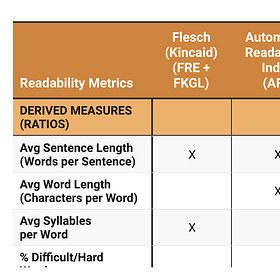
This first table shows how the base counts differ. It lists the average readability data inputs counted by the tools for the 5 evaluated Cases.
This second table shows how the derived measure values for the text elements vary. These differences are at least partly due to variations in the counts their formulas use.
Analysis of Results
All of these variations in the counts drove, but did not fully explain, inconsistencies in the readability metrics. In some cases, the math looks wrong, as it did with Word (see Readability features of Microsoft Word for details). That, or the right values going into the math aren’t being displayed.
Overall, in none of the 5 cases did more than 2 of the 8 tools (including Word) come up with close readability scores or grade levels, even for the FRE metric.
At the extreme, TextCompare had some wacky values for the LW metric in cases 2, 3, and 5 (grade levels of 20, 7.7, and 29). These scores aren’t explained by differences in the counts.
With that background, here are the questions I wanted the data to help me answer about the tools and metrics I evaluated.
Q1: Which METRICS Are Most Consistent?
Part of my readability tool evaluation is choosing new metrics (besides Flesch) for measuring my writing. Which ones should I pay attention to?
Data question: Which METRICS are calculated most consistently, and least consistently, by all tools that support them?
A1: What the Data Says.
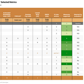
The data in this table shows the variations across all tools for each of the 5 cases. In brief, here’s how each metric performed.
Flesch reading ease (FRE) is the most consistently scored across all tools (7.4% overall variation). This is not surprising; the Flesch metrics are the best established. They were likely used in studies for validating the other metrics.
FKGL shows higher variation than FRE (13.6%). This seems odd at first because it uses the same inputs as FRE. However, some tools give imprecise FKGL values (“9th grade”), while others show calculated values (“8.63”).
The FOG index was next best to FRE (13.1%), and SMOG index was third (17.3%).
The ARI and LW metrics show the most variation (22.6% and 20.7% respectively). The worst-case variations (high GL values) came from the TCR tool on the LW metric (40.5% and 46.3% for case 2 and case 5).
Only two of the evaluated tools support the LW metric. One (TCR) produced extreme outlier values on 3 of the 5 cases. Bottom line: Not enough information to evaluate if LW is valuable to me.
No variations across tools were measurable for FORCAST; only RF supports it. However, FOR values from RF were close to the overall median for 4 of the 5 cases.
The overall Grade Level for these 5 cases is 10.35. Variation of 10% or more means the result for that tool and / or metric is off by more than 1 grade level.
Note: In theory, the SMOG index is only defined for posts over 30 sentences. However, all tools except DY calculated and displayed SMOG for all 5 cases. Datayze calculated SMOG for cases 2, 4, and 5 (30, 123, and 238 sentences).
If the best tool doesn’t support ARI or LW, I’m going to be ok with dropping them. I might not need to down-select, though.
Q2: Which TOOLS Are Most Consistent?
I want my new tool to be reliable. If it gives me a score or grade level that seems very high or very low, I don’t want to wonder if the tool is wrong. I want to trust that I should look into my words and find things to fix.
Data question: Which TOOLS produce the most accurate COUNTS, and GRADE LEVEL results that are most consistent with the consensus grade level across all tools?
Since variations in sentence counting dominate most of the metrics, here’s a table showing the consistency of the base counts. “Sentences for Formulas” deserves a call-out. Our previous insights suggest that tools that can count sentences that don’t end with punctuation are probably correct. That includes RF, GRAM, WFX, and WC. The other 4 tools are undercounting and will have worse metrics.
To answer Q2, let’s look now at which TOOLS produce GRADE LEVEL values that align best with the consensus grade level across all tools.
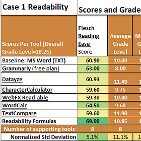
This stacked line graph shows the average FRE (Flesch Reading Ease) scores and the median Grade Levels for each tool.
This Datawrapper dot graph shows how the average Grade Levels for the 5 cases differ across the tools. (A line graph and a visualization of the table are also available.)
TCR appears to be the most negative (lowest FRE, highest GL). We also saw earlier that it had some very large outliers. WC appears to be the most positive (lowest GL). That makes both tools less-preferred.
The graph above shows absolute grade levels. Relative differences may give different insights. I calculated an Overall Grade Level score as the median across all tools and all Grade Level metrics.
This graph shows differences as percentages of the Overall Grade Level, for each combination of tool and metric. (A visualization of this fourth table shows how each Grade Level, and the Reading Ease score, compare to the medians.)
This is consistent with the earlier dot graph. It shows that TCR is above the median (more pessimistic) on all cases and all metrics. WC is below (more optimistic) on all but one.
Since the Overall Grade Level (median) is 10.35 for these 5 cases, a variation of 10% or more means the level is off by more than 1 grade for that tool and metric.
A2: What the Data Says.
Based on this data, RF and WORD come the closest to the median Overall Grade Level. WFX is next best. GRAM is not among the best 3 on grade level, but it’s one of the best 3 for reading ease score, along with WFX and DY. RF’s variations are under 11% except for FOG, which is highly inconsistent across the 6 tools that support it. (All variations but one variation are in the range of 14.2%-37.5%.)
Here are some key observations about the tools across all cases and the metrics they support.
TCR and CC are the most negative (average grade levels 13.2 and 12.04).
TCR is highest on LW, FOG, and SMOG.
CC is high on FOG.
WC gives the lowest grade levels (average 8.35). GRAM is second lowest, on FKGL (average 8.60).
WC scores ARI very low. Since the tool does not share many of its counts, investigating the root cause isn’t straightforward.
RF results are as close to the overall mean as WORD (-4.2% low).
RF’s FOR metric is the closest of all metrics and tools to the overall median (-0.3% variance).
The SMOG index is a close second (0.9% variance).
Conclusions
The next step is to make and execute my decisions on which tool(s) and metrics to use. That happens here (very soon). You are welcome to subscribe to be notified automatically when new posts are published - it’s FREE!
References
TO DO: Add link to final post after it’s published.
More Data on Writing about Data: Details on the 5 Cases Evaluated for Readability
This post is for “scuba divers” who like to go really deep on data. It shares ocean-floor-level details and data on the 5 example cases I used for my evaluation of readability analysis tools. Next up: my decision on which tool(s) to use in my ‘ethical shoestring
Worth a try? A look at 14 readability analysis tools
My main post on readability metrics, tools, and evaluations is here (coming soon!). Four bonus pages provide details: Readability features of Microsoft Word and why I’m looking for a new tool. What “readable” means, 16 metrics, the 6 I chose to evaluate, and why.
What’s “readable”? 16 readability metrics and what they miss
My main post on readability (metrics, tools, and evaluations) is here (coming soon!). Four bonus pages provide details: Readability features of Microsoft Word and why I’m looking for a new tool. What “readable” means, 16 metrics, the 6 I chose to evaluate, and why. [
Using MS Word for Readability Analysis
I’ve used Word’s size and readability statistics on 3 months of Substack and LinkedIn posts from this year. My conclusion is that the Readability Statistics in Word are too flaky to be useful, and I need to find a better tool. Here’s why. Details on Microsoft Word’s Readability Features


