


Free logo design tool: Zarla
After 4 months, it was past time to create a logo design for my newsletter (yes, this one!) Here's how I created a new logo design this week without breaking my budget. Let me know what you think!

Need a logo for your Substack newsletter? I did 🙂. Until a few days ago, my newsletter didn’t have its own brand icon and wordmark. I decided to fix that this week.
Regular readers know I’m always on the lookout for “cheap and good” (preferably free) tools we writers can use for our newsletters. My ‘ethical shoestring’ list already had sections for “icons and images”, “image editing”, and “freehand drawing”. Logo design might benefit from more support than those tools could provide, though. So I looked into free tools for creating logos. Here’s what I found.
Contents of this post: (will be hyperlinked after this article is published)
NB: I will be the first to admit that I am not an artist or a graphic designer. I’ve never had any training or mentoring in art outside of required public school courses. The closest I’ve ever come to creating art is through photography.
I do have family members with graphic design expertise. At some point, I’ll tap them for advice and (when I can afford to) pay them to design branding and images that will be 100x better for my newsletters and for my future AI books. My goal for this week, on my shoestring, was to create something for my newsletters that’s better than boring plain text or my face. (How’d I do?)
Substack Brand Images Needed
I had looked briefly at Substack’s brand image requirements in March, when I experimented with reviving a themed wordcloud generator I wrote in Python 1. This post said that 4 different image sizes with 3 different aspect ratios are needed for complete Substack branding (all are optional, though):
256x256 (at least) - Logos for publications, publication sections, and personal profile, with transparent background, 1:1 aspect ratio
600x600 (at least) - Cover image, appears on publication welcome page (assumed to be used at 1:1 aspect ratio)
420x300 (minimum), 1456 x 1048 (recommended; can be larger) - Post image for search engine optimization, at 14:10 aspect ratio
1100x220 (or taller) - Email header image with a transparent background, aspect ratio 5:1 (will be less if taller)
A 5th optional image, with a different size and aspect ratio, is also possible: 1344×256 (at least) - a stylized “wordmark” for the header of the publication (minimum size, aspect ratio not to exceed 21:4).
Image 3 is per post, not for the publication, so not relevant right now.
Image 4, a new email header image, would be a nice bonus but could wait. I’ve been using a mountain scenery photograph that has been my banner image on Twitter and Facebook for years. I just annotated it last week to add my Substack URL there🙂.
In sum, my goal was to get 3 new branding image files this week (1, 2, and 5):
a new high-resolution publication logo (preferably 1200x1200) on transparent background that would size down well to 256x256.
a cover image for my welcome page (same file as the 1200x1200 logo image?)
a 2688x512 wordmark image for the publication header.
Searching for a Logo Design Tool
The obvious tool choices were the big names - Canva and Adobe.
Adobe Express logo maker is free and does not require a credit card. But I’ve been watching how they have been treating the rights of their photographer customers and other creative users this year. I’m not comfortable with their AI ethics 2 3.
Canva offers a free logo maker. However, some concerns have also been noted this year about Canva’s AI ethics 4.
So I did some web searches (not AI-driven, if you’re wondering) to see what else was out there. I found two options which looked OK but weren’t free. They are free to experiment with, and may give you some good ideas, but payment is required to purchase a logo.
Logology - $79-$699 to buy
Looka Logo Maker - $20-$65 to buy just a logo (more cost insights here).
By reviewing competitor lists, I found one which is truly free for creating a logo: Zarla Logo Maker. No signup or personal info is required to start using it 👍. An email address is required before you can download, and they send you a download link, but that’s it. Their business model is based on people opting to pay to build and host a website (“with AI”!) with the logo and branding they build.
When first providing an email address and clicking Download, a user gets this page. There’s no obvious way to proceed without clicking one of those two buttons, but clicking outside the dialog got me out.

After that, each time you edit the logo and request a new download, the page prompts with the dialog shown below. Clicking “No Thanks, Just My Logo Please” works well.

Since I’m not interested in using these AI-based website building features, I’m not as concerned about the ethics of whatever LLM they are using under the hood. But if you’re considering going down that path, and AI ethics matter to you, I recommend asking the company about it. Zarla’s privacy policy isn’t clear. (I’ve inquired, but don’t yet have an answer.)
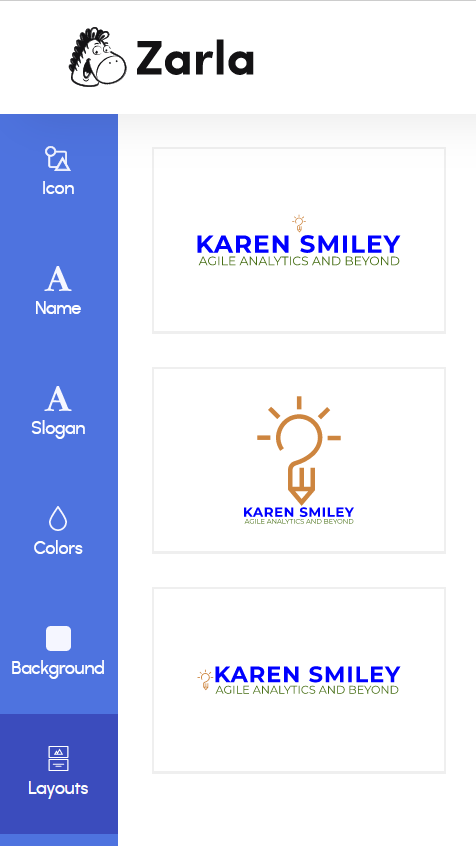
Using Zarla to Create Draft Logos
In Zarla, a logo has 5 basic elements, all selectable or configurable: icon, name, slogan, background, and layout. (The sidebar also has a colors tab, which I never used.) The Ideas tab supports searching for a new icon. The Icon tab supports configuring the one you’ve selected. Here are side-by-side screen shots of the configuration options for each.
Size (1-10) and Margin can be set for Icon, Name, and Slogan.
Spacing can also be set for Name and Slogan, to spread out the text.
Color can be set on all 4 elements, with 2 colors selectable for Icon.
Icon, Slogan, and Background can be shown or hidden.

What I Did
I created my logo in the wide layout with icon on the left of the texts, and then in the square layout. I downloaded each set after I created it. Here are the steps.
The initial prompt is for the brand name, which can be 4-40 characters. (I don’t see how a 40-char name would fit in a Zarla website layout. Maybe it fits on merchandise?)
The site immediately showed example logos (square) with different combinations of colors and icons. Slogan is optional and icons can be changed readily. I just picked one and went into “Customize icons, colors, text…”.
Background: I set the background to transparent (chose not to show background).
Colors: I initially chose the same brown that I configured into my Substack newsletter settings (“Peru”), the blue from agile Teams, and the green from 6 ‘P’s in AI pods.
Icon: you can put in keywords to search for options, and you can choose one or two colors for it. The color selections are automatically applied to the icons in the search results, which is nice. I found icons that I liked and chose 3 for generating logo sets - a magnifying glass with computer traces, a “lightbulb - pencil”, and some mountains.

Name and Slogan texts: Font choices are quite limited - about 8 choices for each. The name font choices are bold. The slogan font choices are not. Then I played with different combinations of text sizes and margins. This was a bit awkward, because changing the size or spacing of one changed how the other fit, and the name and slogan are on different tabs. But I was eventually able to get something I was ok with.
Note: there is only one download set per “logo” (URL). If you change the logo settings, you can’t go back and download the older version of the files. The only way I see around this is to “Create a new logo” as a second file set with a new unique URL. Which way is more work will depend on how many times you iterate.
One way to avoid the double work of two layouts or two logos would be to use the SVG file from the wide layout, crop out the icon (on the left), and enlarge it to use as the Substack profile picture. Since it’s SVG, the quality of the result won’t be degraded by resizing.
Importance of Layout
One quibble I have with Zarla Logo Maker is how you choose and use a layout. If you choose a new layout, the size, margin, and spacing settings you already configured will be reset 🙁. This isn’t obvious at first. Layout should really be the first thing a user is prompted to choose (select it on the ‘new logo’ page or put it at the top of the menu).
For example, here are the 3 layout options offered after I chose the ‘lightbulb pencil’ icon from the Ideas:
icon (initially small) on top of 2 text lines (wide),
large icon on top of 2 text lines (square), and
small icon to the left of 2 text lines (wide)
At first I thought I could generate a square logo (choice 2) for use as a profile picture, and a wide banner for my wordmark and as an email header (choice 3) within one “logo”. It doesn’t work that way.
The free social media site image sets that can be downloaded include square profile images as well as the ‘hero’ banners. However, inside the set, all images share the same wide or square layout of icon, name, and slogan.
Empty padding is applied to make the various social media image sizes. That’s a time saver if the required aspect ratios are similar to the layout. The images don’t work as well when they’re not.
Wide Layout
For instance, with wide layout 3 and icon enlarged on the left, the images are:

Here, the FB Profile Picture has very big empty margins at top and bottom, and the slogan is unreadably small. Even the icon is small within the square. Why would anyone want to use this choice 3 wide layout for their profile image?
The choice 3 wide layout works better for the FB Cover Photo. It has lots of white space on all sides. The white space at top and bottom does allow cropping to fit the flatter aspect ratio of a Substack wordmark. The space on left and right is wasted, though. I want to fill my wordmark space with larger text to make it as readable as possible.
Square Layout
When I changed the layout to square (choice 2), I had to redo much of the logo design. The colors, texts, background, and icon I selected were all kept, which helped. The positioning and size adjustments for the elements are very layout-dependent and needed to be reconfigured. Making the icon as big as possible made both texts small.
Here are the counterpart FB images in the square layout. The icon size was maximized and the texts are small. In the FB profile picture, at least the icon can now be seen easily. However, the FB cover photo image wastes a lot of space on the left and right - not how many users would likely want to use the banner area. And this definitely wouldn’t work well for a flattened Substack wordmark.

What I Got (for FREE)
For the examples in this section, I used a light yellow background with tan and blue for brand colors. This solid background shows the edges of the images and how transparent backgrounds are handled.
5000x5000 PNG logo files and SVGs (scalable vector graphics) are free to download. 5000x5000 is more than enough for most online purposes. The SVGs allow scaling up even further if needed for higher resolutions.
It was a nice surprise to find that many properly-sized social media images were prebuilt and part of the free download. They include BigCommerce, Etsy, Facebook, Instagram, LinkedIn, Pinterest, Quickbooks, Twitter, and YouTube. (They don’t support Substack wordmark sizes or other brand image sizes - yet 😊.) This can save cropping and editing time if you use multiple social media sites.

Zarla’s download kit for PNG and SVG includes 6 color combinations.
Colorful logo on the chosen background (which may be transparent).
Black icon and text on white.
White icon and text on black.
Colorful logo on transparent background.
Black icon and text on transparent.
White icon and text on transparent.
Here’s what the download page showed under “Free Logo Files”. (When a transparent background is used, the first files in the two rows are identical.)

Here’s an example of the 6 downloadable logo files with the square layout on dark gray background, tan lightbulb pencil icon, blue name, and green slogan.

The green text didn’t show up well on the dark gray. I had to choose an even lighter green than 6P (#84B844) just to get it to show up on the dark background, and even then, I wasn’t happy with it. The text was tiny and low-contrast.
My interest, for Substack, is to have transparent background for my logo, so this wasn’t important. But this experiment reinforced in my mind that text on the square layout for a profile picture didn’t make sense for me.
For most social media sites, only logo files with your selected background can be downloaded. If you choose a solid color background, transparent versions of the properly-sized images are not available.

For a few sites, the logo is provided on both solid and transparent backgrounds.

The download set also includes business card templates (which I ignored), a compact email signature image (transparent), Android & Apple screens (solid), 2 watermark images (transparent), and a 32x32 favicon. In the browser, the favicon background was not shown, but the downloaded icon did have the solid light yellow background.
The download set thoughtfully includes a “brand guide” that captures the exact color settings and fonts used in creating these images. It isn’t a downloadable file, but it can be printed to PDF or screen-shotted.

This brand guide is useful for compatibility. It doesn’t completely capture everything one would need to reproduce the logo, though. The “brand” name in this case is my name, and that is in the title. But the text of the “slogan” (in this example, “Agile Analytics and Beyond”) is not shown in the brand guide. It also doesn’t show the many layout parameters which tweak the positions and spacings of the logo elements.
What I Used
After these experiments, I chose to use just the large icon for my Substack profile picture. (I cut out the unreadable name and slogan texts from the square layout. They can also be hidden in the Zarla Logo Maker editor.)
For now, I used the square layout as is, with the text, for the cover image on the Welcome page.
For the newsletter banner wordmark, I used a wide layout and got this.

Then I rearranged the wordmark elements a bit. I put the icon in the middle and maximized the text sizes, using Irfanview and Paint. I added these files to the settings for karensmiley.substack.com on July 9.

Overall, I’m pretty happy with the logo variations I was able to create in a few hours with Zarla Logo Maker. I wish I had more control over text sizing, positioning, and padding. And I wish the ‘lightbulb pencil’ icon was thicker and could support a second color. (Most of the icons in Zarla are much bolder, and two-color; this one’s an odd exception.) If I keep using that icon, I might try to edit it later to make the lines thicker and recolor it a bit.
Zarla had some quirks, as well as some nice features that showed thought about how people would use the tool. One quirk was that the texts for the name and slogan were sometimes converted to all caps whenever a new layout was selected. On the plus side, having distinct and descriptive default names for the downloadable files was great. (There is a minor bug in the default name for one logo file. I notified the company.) It would be a good time-saver to have an optional one-click download that generates a ZIP file. :)
UPDATE: While finishing this article, I found a ‘pencil rocket’ icon in a Zarla search. It somehow reminded me of the Buzz Lightyear slogan “to infinity and beyond”, which fits my newsletter. And it’s much easier to see in 256x256 size than the ‘lightbulb pencil’ icon. So I used it!

As I did with the ‘lightbulb pencil’ icon, I cropped texts off the square logo. Then I changed the rocket ‘flames’ to blue, and rotated the icon 45 degrees to fill the square space better. For the wordmark, I enlarged the texts and merged in the rotated ‘pencil rocket’. I added these files to my Substack branding on July 10 😊.

Bottom line: Zarla Logo Maker saved me time and gave me ideas, and I ended up with something better than I had before (in my non-artistic opinion, anyway). That counts as a success in my book for this week.
I’d love to hear your opinion on the new branding and images, and if there are any logo design tools you recommend!
What’s Next?
Could I have done this design in one of my free image editors, with a free-for-commercial-use icon? In hindsight: sure. Full control over a wide selection of fonts would be a plus, and being able to choose any icon would be good. That might be my next step. OR I might keep the logo as is until I can afford to pay a real graphic designer for my newsletter and book branding.
For now, I wanted to knock out some new and improved branding quickly and affordably, and get back to writing. Zarla Logo Maker helped me do that. It’s now on my ‘ethical shoestring’ list for logo design.
Like all of my new posts, this one is public and FREE! I invite you to share it with anyone else who may be looking for a free logo design tool:
References
Ethical Shoestrings

Anyone else getting started with writing and publishing on a shoestring budget, but wanting to only use ethical tools? This page lists the “cheap-and-good” ethical tool stack I (Karen Smiley) am using on Agile Analytics and Beyond, 6 'P's in AI Pods, and
Wordclouds as Substack brand images?

As a relative newbie to Substack, I’ve been digging into the ‘branding’ options offered for newsletters. Here’s a rundown of my past few days of experiments, in case it might be useful to others. Substack’s image requirements According to this post,
“Adobe’s ‘Ethical’ Firefly AI Was Trained on Midjourney Images”, Harvard, 2024-04-12
Concerns on Canva’s AI ethics (see comments on this post from Johan Brandstedt)
Wow, awesome find!!! I’m looking forward to trying this, I need some logos too 🙌 - thank you!!
Marketers, please don't do this:
Tonight I got an unsolicited inbound email from a logo tool provider I won't name (for reasons that will be obvious). I thought it might ask me to try their tool, but no; they asked me to add a footnote to this post about Zarla to point people to their tool. That's a hard NO for 3 reasons.
1, I didn't try or use their tool, so I'm not about to recommend it.
2, their tool uses unethically-trained generative AI tools in its back end. Not my vibe, as my followers know.
3, I never gave *them* my email address. I refuse to encourage them to contact people via scraped or bought emails by responding positively in any form. The message earned a 'report as spam' instead.
I haven't looked any further at logo tools since this post, but I may have reason to try one again in the next few months. So if anyone knows of another free/affordable and ethical logo design tool besides Zarla, please share it!